Griffith Observatory
👤 Client
Griffith Observatory
📍 Location
Los Angeles
🗓 Year
2021
🙇 My Role
UI UX
UI & UX redesign project for Griffith Observatory’s official website, the goal of the project was to create an easy and enjoyable experience for users to find basic visitor information, obtain details for events, and purchase tickets online.
😣 The Problem
The old website was poorly constructed with confusing information architecture, lack of hierarchy, and unappealing content display. Based on our research, users are unable to locate basic visitor information desired.

🔍 User Research
We wanted to understand the website's current structure and what we could possibly improve, so we went through the following process:
Heuristic Evaluation
The current website's information architecture is not well organized, the placement of many contents seem to be random. The navigation system needs to be rearranged in a more clear structure, and avoid having redundant information.
Competitor Analysis
Comparing to other landmark and space-related websites (National Air and Space museum, Space X, Chinese Theater...), Griffith Observatory's website is lacking an easy-to-user user experience, and the sentimental feel of space or romance that this landmark has.

Previous site design
📋 Definition
We ended up receiving 6 interview feedback and 24 survey results. After organizing the data, we formulated a redefined proto persona-Josh Smith, who has needs and pain points relating to his experiences exploring a landmark’s home page.

A story board was created used the Josh Smith persona detailing his stresses and frustrations for not being able to find general information on the Griffith Observatory website. Josh Smith needs Griffith Observatory's websites to provide clear general customer information (parking, pricing, location, and history) and event details, as well as an easy-to-use user experience. Because the current website is overwhelming with different information and links arranged without order; it's difficult to navigate.

Griffith Observatory's website is designed to provide visitors with information, such as directions, hours, and ongoing events. Users were unable to locate this information due to unclear navigation, lack of hierarchy, and a confusing display of content.
🤔
How might we redesign the Griffith Observatory website so users are able to locate and access important information about the landmark in a quick and feasible manner?
💡 Ideation
Our team barnstormed together, using “I Like, I Wish, What if” method, and organize our thoughts and users' thoughts based off the data we have collected thus far. We organized all ideas onto a feature prioritization matrix, from which, we concluded our focuses for this redesign:
1. Appealing visuals
With the understanding of Griffith Observatory's main attractions, we created a style tile, incorporated with rich colors that reflect the sentiments of sunset, space, romance, and instagram.

2. Easy-to-follow navigation
We went through card sorting, rearranged the categories and created a new sitemap.

3. Interactive calendar for viewing events and purchasing tickets
In the User Flow, our persona Josh Smith has the option to find events from a calendar, and purchase tickets from there.

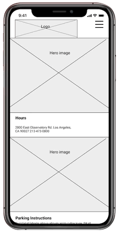
🖊 Low-Fi Prototype
With Mobile First theory, our team decided to tackle the mobile version first.
Using our User Flow as a guide, a Lo-Fi mobile prototype was designed with the intention of usability testing and how users would interact with the product.
🚩 Hi-Fi Designs
Brosing events

Ticket purchasing

Try our prototype below!